ABIS Infor - 2017-12
Analysing the World Cycling Championships with Python
Abstract
September 25 2017, Bergen, Norway: Peter Sagan writes another line of his already impressive palmares. With apparent ease, he wins the Men's Elite Road Race of the UCI World Championships, securing his third rainbow jersey in a row. According to some, it was an utterly boring race, with the only action in the last lap. According to others, it was just another illustration of the magnificent talent of Peter Sagan, and the competitors simply didn't stand any chance.
Instead of just trusting our gut feeling as irrational cycling supporters, we decided to have a look at the data, with the help of Python and some of its excellent libraries for Web Scraping and Data Analysis...
The code snippets in the article are written in Python 3.
Step 1: Obtaining the data
The men's road race of the 2017 World Championships was held over a 267.5 km long course, starting with a lead-in from the island of Rongøyna to the city of Bergen. After 57.4 km the riders passed the finish line for the first time, followed by 11 local laps of 19.1 km in and around Bergen. The only meaningful obstacle in the local laps was Mount Ulriken, temporarily renamed 'Salmon hill' for the occasion, as part of a sponsorship deal with the local fishing industry.
Pundits predicted a race for explosive riders: sprinters who could survive a hill, like Sagan, Matthews, Kristoff and Gaviria. Other countries needed to make the race as hard as possible, to get rid of as many of those sprinters as possible: the French (Alaphillippe), the Belgians (Van Avermaet, Gilbert), the Dutch (Dumoulin) ...
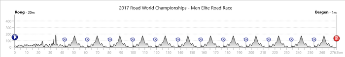
Image source: Tissot timing
The riders passed the finish line for a total of 12 times, and the official timekeeper, Tissot timing, kept track of all these split times for all riders, with a handy web tool for the fans. While this tool is perfect to check where your favourite rider is during the race; for an analysis afterwards, it would be handier to have a nicely structured table with all the splits. A look at the page's HTML source learns us that it should be fairly easy to scrape the relevant bits of data from the page: each rider has his own <div> tag with the class attribute "rider row mix", containing multiple nested tags with the time and position at each split.
The most popular library for web scraping with Python has the interesting name ' Beautiful Soup' (someone should write an article about IT product names ... ). It is distributed through Python's package repository PyPI.
On to our scraping job!
First, we use the urlopen() function from the standard library module urllib.request in order to open the url, then we let Beautiful Soup create a BeautifulSoup object, which contains all the HTML of the passed document, as a navigatable data structure (based on the HTML-tags in the document):
from urllib.request import urlopen
from bs4 import BeautifulSoup
url='http://www.tissottiming.com/Stage/00030E0105010401FFFFFFFFFFFFFFFF/default/Live'
page=urlopen(url)
soup=BeautifulSoup(page, 'html5lib')   # use the html5lib library to parse the page
Once this object is created, it's fairly easy to fetch the relevant data. The following line of code will create a Python list object containing one element for each rider, using beautiful soup's find_all() method and the appropriate HTML tag:
riders=soup.find_all(name='div', attrs={'class':'rider row mix'})
To get the name, rank and bib number for each rider, we can simply loop through our list of riders and use the find() method with the right HTML tags. To get rid of all tags and only retain the actual data (trailing white space removed), we use get_text() and strip().
for rider in riders:
    name=rider.find(name='div', attrs={'class':'name'}).get_text().strip()
    rank=rider.find(name='div', attrs={'class':'rank'}).get_text().strip()
    bib=rider.find(name='div', attrs={'class':'bib'}).get_text().strip()
In the same fashion, we can fetch all the other relevant information, like the rider's nationality and his position and time gap at each passage. Using the standard print function, we can send all the relevant data to a csv file, a structured source for our analysis.
At the bottom of this article, you can find a download link for the scraped data.
Step 2: importing and cleansing the data
Now that we have a csv file containing all our data, we can import it in an analysis environment. A popular choice is the pandas library. It supports dataframes, spreadsheet-like objects, that come with a handy indexing system and fast methods for column-based operations. Pandas is an interface build on top of NumPy, the most fundamental package for scientific computing with Python, which provides fast multi-dimensional arrays, a necessity to process large datasets.
Importing data in pandas is a breeze:
import pandas as pd
allsplits=pd.read_csv('wc2017splits.csv')
Importing from and exporting to Excel files, SQL-database tables, Python objects, XML, JSON ... goes with similar ease.
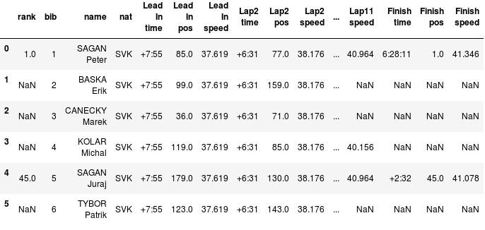
Our csv will now be loaded in a pandas dataframe, a table with one line for each rider and one column for each attribute we scraped. An extract looks like this (notice that Sagan's brother Juraj was the only one of Peter's team mates that finished the race):
allsplits.head(6)
It takes some practice to get used to pandas' indexing, sorting and filtering mechanisms, because of their vectorial/functional nature, but once you get the hang of them, it becomes fairly easy to fetch a relevant subset of our dataframe. For example, the top-5 of the race:
allsplits[allsplits['rank']<=5].sort_values('rank')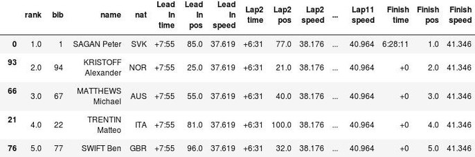
Usually, the most time-consuming part of a data analysis is cleansing the data: getting the appropriate data types, formatting etc. In our case, the content of the time columns is far from ideal: the first rider to pass a certain checkpoint gets his actual time, while for all the other riders the time gap is stored as a text string. Another problem are the average speeds, which are calculated cumulatively during the race. We might want to see the actual lap averages as well. We can start by filtering out the race leaders at each lap, and with the help of pandas' conversion functions, such as to_timedelta, we can calculate the actual lap times and speeds for each rider at each time split.
Step 3: analysing and visualising
In this case, the lap speeds are quite interesting: since the world championship is raced on a closed circuit (except for the lead-in), the course is identical between any two splits, which makes the lap speed a pretty good measurement for how intensive the race was during that lap. A decent visualisation makes it easy to interpret this information. There are many good libraries for visualisation in Python, but the godfather of them all is Matplotlib, which is part of the SciPy ecosystem, just like NumPy and pandas.
In the following graph, we plotted the lap speeds of Peter Sagan (blue line), the eventual winner, and Irish rider Conor Dunne (green line), the very first rider to attack, who was in the early breakaway. We also plotted Sagan's average speed for the whole race (orange dashed line). Since Sagan was in the peloton for the whole race, the graph will be the same for any rider in the main bunch. We use matplotlib's 'pyplot' interface, which is convenient for simple plotting jobs. In order to keep the following code snippet concise, we derived an adjusted dataframe, called speeds_adjusted.
First, we import pyplot, make a plot figure and set a visual style:
import matplotlib.pyplot as plt
plt.style.use('seaborn-whitegrid')
fig=plt.figure()
Then, we plot Sagan's and Dunne's lap speeds, and Sagan's overall average speed:
plt.plot(speeds_adapted['TOTAL DIST'], speeds_adapted['DUNNE SPLIT AVERAGE'],
         '-', color='LightGreen', label='Dunne lap speed' )

plt.plot(speeds_adapted['TOTAL DIST'], speeds_adapted['SAGAN SPLIT AVERAGE'],
         '-', color='SteelBlue', label="Sagan lap speed", linewidth=3)

plt.axhline(y=allsplits[allsplits['rank']==1]['Finish speed'].values,
         '--', color='Goldenrod', label='Sagan race average')
Some visual optimisations: the legend position, the limits and labels of the axes:
plt.legend(bbox_to_anchor=(1.05, 1), loc=2, borderaxespad=1.)
plt.xlim(xmin=0,xmax=267.5)
plt.xlabel('Distance Raced')
plt.ylabel('speed')
Et voilà:
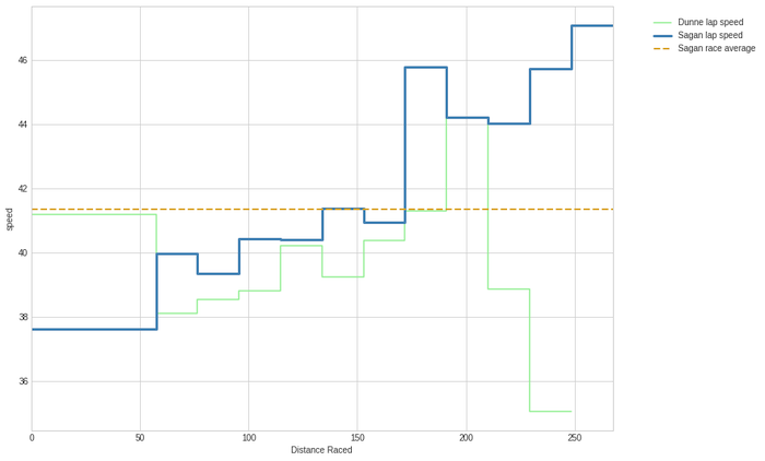
The graph illustrates the typical start of many championships: a group of lesser gods goes for the early breakaway, while the peloton starts at 36.6 km/h, a leasurely pace (for professional riders). Throughout the first 150 km, the peloton's tempo gradually increases (with one guy, Belgian rider Julien Vermote doing almost all the work), and the gap with the leaders diminishes. This is very similar to what happens in many grand tour stages.
The most interesting thing about this graph is the sudden hike of the blue line with 5 laps to go: at that moment, the tempo in the peloton increases abruptly, with Belgium, the Netherlands, France and Australia sending fresh riders to the front. Dunne and the other remaining riders in the front group get caught. We can see how he manages to follow the peloton's speed for one more lap, but then exhaustion kicks in. Dunne won't make it to the finish.
Meanwhile in the peloton, there are some attacks (with Lars Boom and Tim Wellens playing an important role), but the peloton, lead by the French, keeps the tempo high. When we go into the last lap, none of the favorites has made any move. The race is decided in a very fast last lap (over 47 km/h).
This graph gives the impression that the race might not have been hard enough for strong, but less explosive riders. If they wanted to get rid of as many sprinters as possible, they needed a very though race. In this case, the final clearly started with less than 80 km to go, and that might have been too late for these riders, given the high overall quality of the peloton, and the relatively easy parcours.
A way to test this hypothesis, would be to have a look at the size of the peloton. Since we have info of the time gaps for each rider at any split, we can calculate the size of the different groups on the road and plot them in a stacked horizontal bar chart: The front group is plotted in blue, the peloton in orange etc.
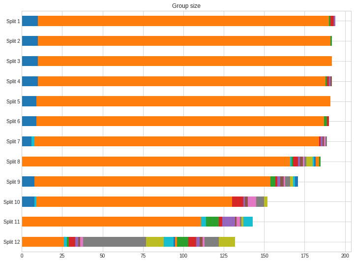
This chart seems to support our theory: the race exploded very late: only in the last few laps, a lot of riders start being dropped from the peloton, and all the important differences are made in the very last lap. Lesser gods managed to stay on board for quite a long time, and the teams who wanted to get rid of most sprinters, could have probably done more to achieve that goal. Julian Alaphilippe got close with a punchy attack on the last climb, but in the end, all the top positions were for sprinters who can survive some hills, as predicted by many.
We might ask the question whether all these sprinters followed the same race tactics. Let's simply plot the positions of our top-5 riders throughout the race:
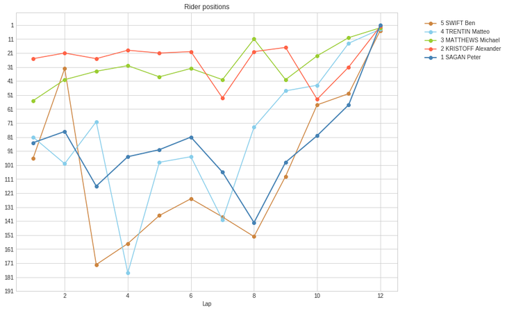
We can clearly distinguish two different tactics: Kristoff and Matthews were constantly in the front of the peloton. If anything important would have happened early in the race, they would have been able to respond. The downside of this tactic is that it costs energy to constantly maintain such a high position, even with the help of teammates. Meanwhile; Sagan, Trentin and Swift followed a more laid-back approach: they stayed in the middle (or even the tail) of the pack for most of the race, and only came to the front at the end. Sagan himself is the most extreme example of this: even going in to the last lap, he was still quite far back, in position 58. Although this is risky, we have to conclude that he made the right prediction, not wasting any energy until the very last few kilometers.
Kristoff loses the race by just a few centimeters. Could he have beaten Sagan in the sprint if he economised more during the race?
Conclusion
We 'll leave it at this for our short analysis. In the end, we can conclude that those who saw a boring race probably have some data to support this thesis, and that Sagan made the right tactical choices. However, there is more information to gather from this data: we made the raw data available and some other data scientists already played around with them as well (links below). Combined with other data sources, like power data of individual riders, coaches can learn a lot from this as well. Try it out yourself, and show us your results!
Try it yourself!
With the tools available to us nowadays, the possibilities of extracting valuable information out of data are greater than ever. Thanks to libraries such as Numpy, pandas, and Matplotlib, Python became one the main languages of choice for Data Analysts and Data Scientists. You can come and explore the tools used in the article (and more) during some of our courses:
- Python fundamentals
- Python for data analytics
- Python for web scraping (to be announced)
LINKS
- Tissot live link:
http://www.tissottiming.com/Stage/00030E0105010401FFFFFFFFFFFFFFFF/default/Live - Beautiful Soup: https://www.crummy.com/software/BeautifulSoup/
- Scraped data: https://pastebin.com/PAibk05R
- Scipy, Numpy, pandas, Matplotlib: https://www.scipy.org/
- Data scientist and cycling enthousiast Billy Fung played around a bit with our data set as well: https://billyfung.com/writing/2017/09/analysis-of-2017-elite-men-world-championship/